V
主页
京东 11.11 红包
拉丁字体史揭秘 #1 粗体与胖体起源 - Sébastien Morlighem
发布人
https://vimeo.com/516485231 该网络研讨会旨在重新评估英国在19世纪初期几十年创造的粗体和胖体的作用,将展示许多鲜为人知的文档和示例。
打开封面
下载高清视频
观看高清视频
视频下载器
拉丁字体史揭秘 #2 无衬线开端:法国 with Sébastien Morlighem
设计师明朝体扫盲讲座
无衬线体真正起源 - Jon Melton
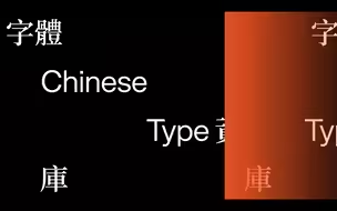
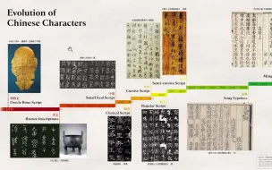
中文字体档案 - 朴瑜俊/林欣荣/王乃谦/Stephanie Winarto - Letterform Lectures
字体研究-秀英体-向人传达感情的字体
法国早期无衬线体(1834 – 44) - Sebastien Morlighem - ATypI
Franklin Gothic永无止尽 - Nick Sherman
手稿·手写体·复原 - with Carl Rohrs
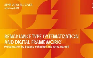
复刻文艺复兴时期字体 系统化与数字化框架 - AtypI 2020
德威金斯与Linotype - 官方发行 with Bruce Kennett
在20世纪20年代作为独立字体设计师蓬勃发展 - Shrenik Ganatra
描绘25年 (1945 - 1970) with Peter Bain
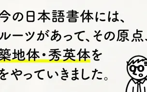
未受築地体・秀英体影响的正文字体
字距的所思所想 with Nathan Willis
字体立方 - 理论模型的实践研究 with Erik van Blokland
19世纪字体经验 - marta bernstein
马修·卡特对阿德里安·弗鲁提格的致敬
80年代纽约凸版印刷的黄昏 with Ron Gordon
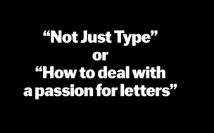
不仅仅是字体 or 如何处理对字体的热情 with Maria Doreuli
奇怪但值得一看:Otto Hupp为Genzsch & Heyse设计的字体
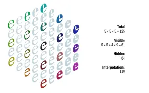
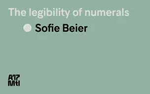
字体中数字的可读性- Sofie Beier - ATypI 2017
字体人物志 —— Enric Crous Vidal
评论赏析Bodoni正文字体及斜体 with James Clough
Learning to cut punches in the 21st century - Ramiro Espinoza
荷兰设计大师 - 卡尔•马藤斯 Karel Martens
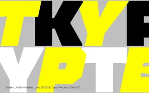
语境中的字体 - Torsten Lindsø Andersen (纽约字体指导俱乐部沙龙)
数字时代之前的字体样本: 整合、考察、传播 - Stephen Coles - ATypI 2017
[Fontribute] Italic斜体设计须知 - 述评Adobe Garamond字体设计
巴斯克地区字体 - 书写主见
多场景响应式宋体 - 书苑宋 - 文鼎字型 Edwina Lee
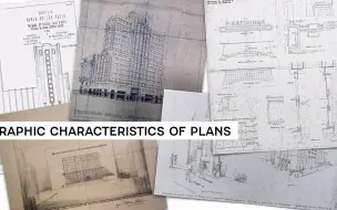
建筑图纸中艺术装饰风格文字 - José Roberto D' Elboux
时装界的字体 - Elizabeth Carey Smith - TYPO Talks
字体追随工具 - Dr. Martin Lorenz
有时,多即更多 —— 标题字体的辩护 Marta Bernstein
拉丁字母简史 04 - Lynne Yun
字体样本的演变 - Pedro Amado, Catarina Silva
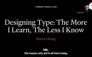
设计字体 - 学然后知不足 - Karen Cheng
2019 TDC 世界最佳字体颁奖仪式
视觉备忘录:1969-1979 IBM海报项目 with Robert Finkel and Shea Tillman
Opentype 高级特性漫谈 - ATypI 2016@华沙